Wednesday, December 2, 2009

hey everyone. just so you know, all of my pieces have been printed out (except the "circle" one). I have ten pieces altogether. I have also ordered my frames, and have framed up one of my images. They are pretty large once the frames are put on with mat board and all...24x36 inches approximately. I will be bringing one image in for the final critique, and therefore, will not be posting up any pictures of the final appearance until after that. I want everyone to see it for the first time at critique.

Since I have all of my images done, there isn't really much else to show here for the semester. You've already seen the final lineup, and so I don't want to just write a bunch of blog posts, just for the sake of blogging. I was extremely focused on my digital art pieces for the first part of the semester, and spent more time outside of class working on those images, than i did doing anything else, including work from other classes, leaving work early, putting off studying, and even resisting sleep sometimes. So just in case anyone doubted the amount of effort/time i put into my pieces, you have now heard it from me.

Monday, November 16, 2009


This is my design for the 2010 faculty exhibition postcard. (I've been working on this also).
Above is the final "lineup" of my projects. The "circle" one has been replaced with a different image, which definitely pulls the whole thing together.
Hey everyone. I know it's been a while since I last posted. That doesn't mean I haven't been working on anything. I have been busy refining my current images. I am extremely attentive to detail and I want to make sure all the edges of lines are cleaned up and do not appear "photoshopped." It has taken a while to get them completely touched up. So my plan is to print 10 images total onto watercolor paper at 18" x 30." I will be purchasing frames within the next week I think, and then I'll be matting and framing them up for the remainder of the semester.

Sunday, November 1, 2009

Here are some more recent "shapes in water" pictures. These were taken with studio lights this time to get some cleaner results. Perhaps I'll print out a second series involving these images...

Thursday, October 22, 2009

This is definitely better than the last only-circle image. I'm feeling good about this one. It's almost done.

Monday, October 19, 2009

....and done. I think. This one will be replacing the "circle" one.

Sunday, October 18, 2009


A new image. I'm still working on it, but I figured I would post what I had so far. I'm trying to incorporate some circular elements with the style of the last image posted.

Friday, October 16, 2009

just messing around with my camera.

...

Wednesday, October 14, 2009

As promised, here's the new series in progress image. woohoo.


Here's the latest image. I've been struggling with this one for a while, but I think it's pretty much done.

Circle image...reworked. Any thoughts?

Tuesday, October 13, 2009

First of all, I'd like to say thank you to everyone for giving me some very good feedback at the critique on Monday. I have reworked one of the images that I showed, and it definitely looks better now. Let me know what you think. (old version vs. new version)


Friday, October 9, 2009

....and another new image. When I finish the next one, I'll put them all together and upload another "series in progress" image.
Here is my latest image. The circles are back!

Thursday, October 8, 2009

More photos! I found a bigger container to put shapes in so this was much easier to do. This time I used a lamp....just testing things out again.


Wednesday, October 7, 2009

This was an experiment. I took two pieces of square memo paper and cut them up into shapes. Then I got a black, shallow container and filled it with water. Then I dropped each shape into the water and moved them around slightly and pushed some down into the water to compose the shots. The light is from a window off to the right. These were taken hand held.

New Sketches! Value patterns coming soon...(to a theater near you......?)

Tuesday, October 6, 2009


I thought I would upload the series in progress again with the new one included. (I'll probably keep doing this each time I add an image).

Monday, October 5, 2009


new image!

Saturday, October 3, 2009


This is for anyone who might be interested in seeing what all of these images look like together.
Hey everyone. I was able to get another image completed (I think), and had enough to submit to the MOCA slideshow. The images I picked were the 2 that I finished last semester with (the colored geometric construction ones), and then the last 6 images from this semester so far, including the one below. I hope you like it!


Thursday, October 1, 2009

I was putting some dishes away this evening and then I thought about taking some pictures of the glasses that were there. So I did. And then I wanted to do a water drop picture. So I filled up a little glass to the top and did this. All the little dots you see are air bubbles because I didn't feel like waiting for them to go away. And I actually really like the way they look.
Maybe trying to make a perfectly symmetrical image isn't such a good idea. Or maybe just not for this particular image. So I've cropped the image slightly to offset the center a bit and "ground" some of the edges.

Eyes?! Oh man. I should seriously come up with a name for this image based on the things everyone is seeing in it. What could be next? Bubbles, balloons, upside down mickey mouse? Anyway, Thanks for the constructive criticism!

Wednesday, September 30, 2009

I've been working on this image non-stop since I posted the sketch about 3 1/2 hours ago. I'd like to consider it finished. And I really like how the square-based approach worked out for this. Hope you like it too!
So these are my newest sketches. Let's start with the one on top.

As I mentioned in class today, I wanted to start working with squares. So I went home and started working on this. Squares are more challenging to make because they involve more steps and more accurate construction lines so that they are actually square! As you can see, this one is pretty asymmetrical and contains many overlapping sections. I'll be starting the value soon.

Now for the lower image. Here is another symmetrical composition, although this one is definitely more complicated than my sphere image. Coming up with a value pattern for this one is going to be a challenge.

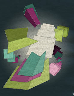
Both of these new images should stand out from the others because they are based on square construction rather than circular and triangular construction. All of the angles seen above are either 45 or 90 degrees. There are no in between angles formed here since each additional shape is formed from an existing line within the image. In future images involving squares, I will create true overlapping by basing shapes off of multiple lines instead of just the initial drawn line. If you don't understand what I'm talking about just ask me and I'll try to explain it a better way.

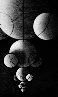
Ok, well, as you can see, I have flipped the image upside down so that it will hopefully no longer make you think of frogs, snow men, or bears. I have also enhanced the contrast of the spheres to make their spatial placements more apparent. I did try removing the vertical line as Laura suggested, but it just looks really weird and takes away a key element of the entire "construction" process. Adding in diagonal lines would require more shapes to be drawn because I am avoiding adding extra lines that don't serve a purpose for construction. For this piece I wanted to just go completely symmetrical in terms of form, but I have added value patterns that should disrupt this symmetry slightly. Thanks everyone for all of the feedback today! I hope you like this reworked version better. I also have 2 new sketches that I'll be posting in a few minutes.
another image that i'm currently working on...

Monday, September 28, 2009

This is my latest image. You'll notice that this one has a more 3-dimensional look to it than the previous images. My plan is to have a mixture of 3d and flat images throughout the semester.
Here is the image I am currently finishing up. I have smoothed out some of the spherical sections to match the texture in the first image. I want to keep things consistent.

Sunday, September 27, 2009

Alright, now that it's working...Here is new image #1:

And here's new image #2:
Ok well, blogger isn't letting me upload any images. It keeps giving me this "internal error" message when I try to. But anyway, I have 2 new sketches done. I'll try to repost again soon.

These are more symmetrical than my previous images. I wanted to try something slightly different while maintaining the same style. Once I establish the value patterns, they should really start to look good. So try to be optimistic when you first view these initial sketches...I know they look pretty bland.

Wednesday, September 23, 2009


My latest image. So far I'm very pleased with this. Feedback por favor.

Monday, September 21, 2009


A few areas have been tweaked, and the entire image has been desaturated. I REALLY like the way this looks. It reminds me of my printmaking work. This seems to be the transition for me from printmaking into digital. I feel like I can control the image much more using a computer, without the headache and frustration of uneven ground coatings and acid foul-bite. So yeah, black and white. I think that's what these images are all about. Let me know what you think.

Saturday, September 19, 2009

i almost forgot to post my progress for this week. anyway, i think this image is nearing completion. right now, all that's left is refining some edges at full resolution. i am feeling VERY good about this piece. let me know what you think! oh, and i don't really know if i want to leave the numbers in or not.....

Monday, September 14, 2009


Here is the image a little further into development.

Friday, September 11, 2009

Ok, this one doesn't have any numbers on it because I havent processed it in photoshop yet. So anyway, this is what I have been up to this week. Hope you like it!
see the construction lines???? that's what i'm talking about. haha. Anyway, it's good to be doing something I REALLY enjoy again. I have another one drawn out as well. I'll post it in just a sec.

Wednesday, September 9, 2009

just in case you were wondering, i'll be posting some beginnings of new images in a few days. going back to the style i finished with last semester.

Friday, September 4, 2009

The current piece I'm working on is really getting me down (the one below). I am not a fan of it. I think it's time to return to the Compass-and-straightedge stuff I was doing at the end of last semester. So much for changing it up a bit with this. I think it's a little too separated from the other style to work out. Who knows, I might go back into it later on and spruce it up some. I don't know though, I'm just not that into it. Better to make up my mind early on though I guess. It was worth a shot!

Wednesday, September 2, 2009

alright here's a start on the coloring-in process. I do not plan on keeping this color scheme at the moment. obviously it is still in it's very early stages. any feedback would be appreciated.

Monday, August 31, 2009

I think it's time to move onto another image for now. I just sketched this up in class today. Again, this is the backbone for the project. I decided to show the numbers here because I label each shape and create custom selections for each one so that I can tweak them independently without worrying about affecting other areas. This was done with the previous image as well.
ok, cropped so that 3 sides of the "object" are touching the edges. also, a slight reduction in saturation from the previous version. as far as the contrast suggestion goes, I honestly think that the contrast is ok, and the subtle changes in value between triangles (especially at the bottom) help to create a gradation.

Sunday, August 30, 2009

here's an altered version with a little more "depth." i've gone ahead and applied a crop as well. i think it's getting closer to being done for real.

Friday, August 28, 2009

Alright, here are a few variations of the original image. I'm really liking the reduced saturation version of the lower color scheme (bottom right). Thanks again for the feedback!
Just in case anyone was wondering what it would like like cropped a little.....Let me know which one looks better.

I would like to consider this image finished. Any feedback would be much appreciated. Please read the previous post for more information about the start of this image.
I decided to give myself some time to think about my major before I made the final decision. So after giving myself the entire summer, I have decided to stick with computer instead of printmaking. More of what I like to do is on the computer, although I enjoy physical interaction with my artwork rather than just a digital one. I feel like I finished the last semester very strongly, and will continue to explore this geometric, process-based artwork. As most of you know, I have been sketching on paper, scanning the image in, and then coloring that image in digitally on the computer for nearly every project since I started taking this course. You can tell that this is a process that I enjoy, and, if implemented correctly, can allow for some very interesting images. So here is my first image for this semester. When I walked into class earlier this week, I happened to spot a piece of canvas that had been thrown away. So I pulled it out, and decided to try drawing on it (because maybe it would be a nice change of texture from drawing paper). The attached image is the backbone to the final project. This is a freehand sketch (no tools involved, no measuring like the images posted below, just to change it up a bit). I will continue to post these initial sketches just so everyone can see the transformation from physical to digital.

Sunday, May 3, 2009


alright so after convincing myself that the cropped version of the last image was better, i went in and cropped the other image just to see what it would look like. i honestly think it looks bad cropped and looks much better and perfectly fine centered and "floating" the other way. i thought you might want to see for yourselves in case you were wondering.
ok so here is the cropped version as you can tell. the main mass is secured by the border on the left and right side. i do think that this helps the composition slightly and i like a more rectangular format. but i still like being able to see the entire structure. but then again, it leaves nothing for the viewer to make up on their own since everything is just being given to them. and i guess i've just convinced myself to use this version. all of my images are going to be around 20 inches tall to give you an idea.